- Published on
Aggregated intrusion detection dashboarding of PFSense metrics and Snort alert logs with Grafana, telegraf, Influx and Loki
- Authors

- Name
- Peter Peerdeman
- @peterpeerdeman
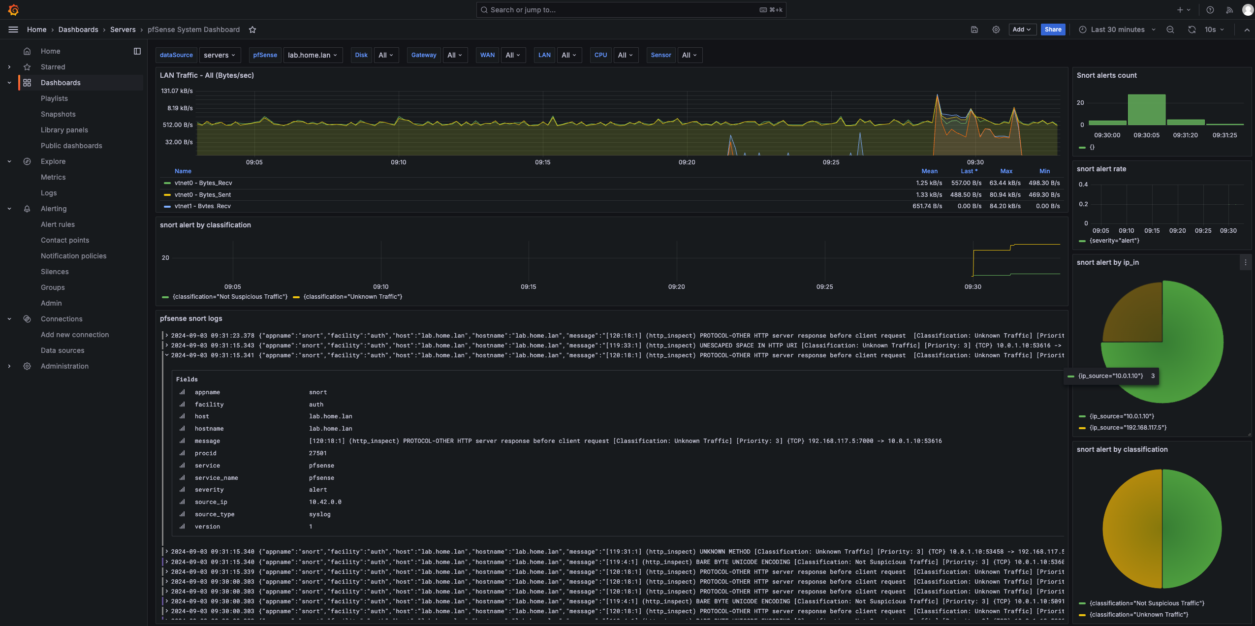
Grafana is capable of showing multiple panels at the same time with different datasources. In the previous blog we setup a logging pipeline for PFSense alerts. In this blog we will combine these logpanels with classic timeseries metrics, show them all in the same dashboard and discover how we can conveniently navigate through time with synchronised logs and metrics.
PFSense and telegraf
PFSense has a nice telegraf package that can be configured to push its core metrics, such as cpu and network activity to an influxdb server. Click System / package manager, search for telegraf and install. You can specify the configuration in Services / Telegraf, be sure to enter at least the InfluxDB server and database name.
Victor Robbellini created an extensive grafana dashboard that uses exactly this data from the telegraf plugin, so log into Grafana, import a dashboard and specify the id 12023 to import the pfsense system dashboard.
Adding our logs to the dashboard
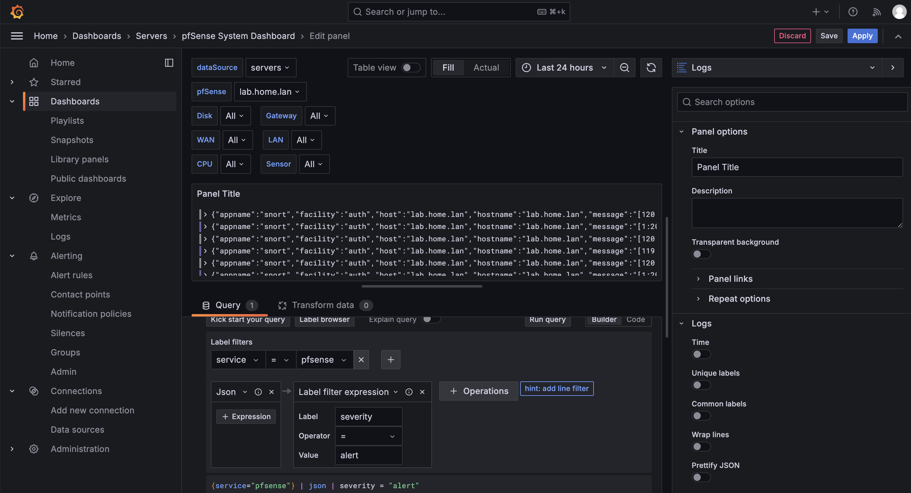
We can now add a panel that shows our PFSense logs: Add / Visualisation, select datasource Loki, set the visualisation type to "Logs" and use the builder to filter the service to pfsense, add the "formats JSON" operation and conclude with a label filter expression where we filter for severity = alert. We should now see our alert lines coming in:
Filtering message contents with regexp
The log lines also contains some interesting data in the message field:
[119:4:1] (http_inspect) BARE BYTE UNICODE ENCODING [Classification: Not Suspicious Traffic] [Priority: 3] {TCP} 10.0.1.10:36826 -> 192.168.117.5:7000
We can use regex to create fields from this message, and then for instance count the number of alerts over time with a specific ip address:
sum by (ip_source) (
  count_over_time(
    {service="pfsense", service_name="pfsense"}
    | json
    | appname = "snort"
    | regexp `(?P<ip_source>(?:\d{1,3}\.){3}\d{1,3}).*?(?P<ip_target>(?:\d{1,3}\.){3}\d{1,3})` [$__auto]
  )
)
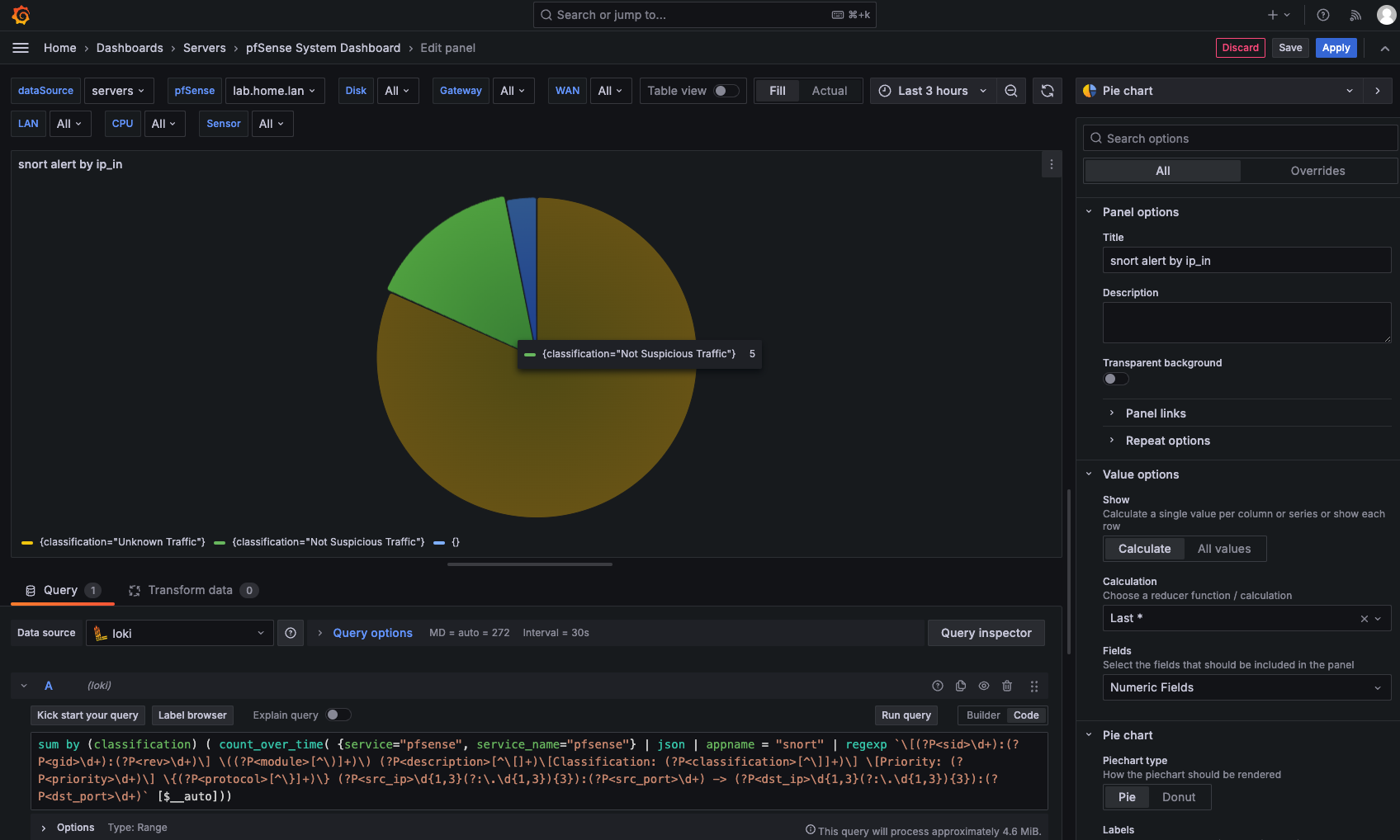
We could even label all of the fields in the message, and create a pie chart for the classification of each message:
sum by (classification) (
  count_over_time(
    {service="pfsense", service_name="pfsense"}
    | json
    | appname = "snort"
    | regexp `\[(?P<sid>\d+):(?P<gid>\d+):(?P<rev>\d+)\] \((?P<module>[^\)]+)\) (?P<description>[^\[]+)\[Classification: (?P<classification>[^\]]+)\] \[Priority: (?P<priority>\d+)\] \{(?P<protocol>[^\}]+)\} (?P<src_ip>\d{1,3}(?:\.\d{1,3}){3}):(?P<src_port>\d+) -> (?P<dst_ip>\d{1,3}(?:\.\d{1,3}){3}):(?P<dst_port>\d+)` [$__auto]
  )
)
If we add all these together with the network traffic metrics, you can get really interesting overviews and spot correlations between traffic and alerts. In the following example, you can see a small spike in network occuring and correlating to the snort alerts by classification. An added bonus is that the log view is filtered by the current timeframe as well, so you can easily drill down into the original alert logs once you have found the timeframe you want to inspect.